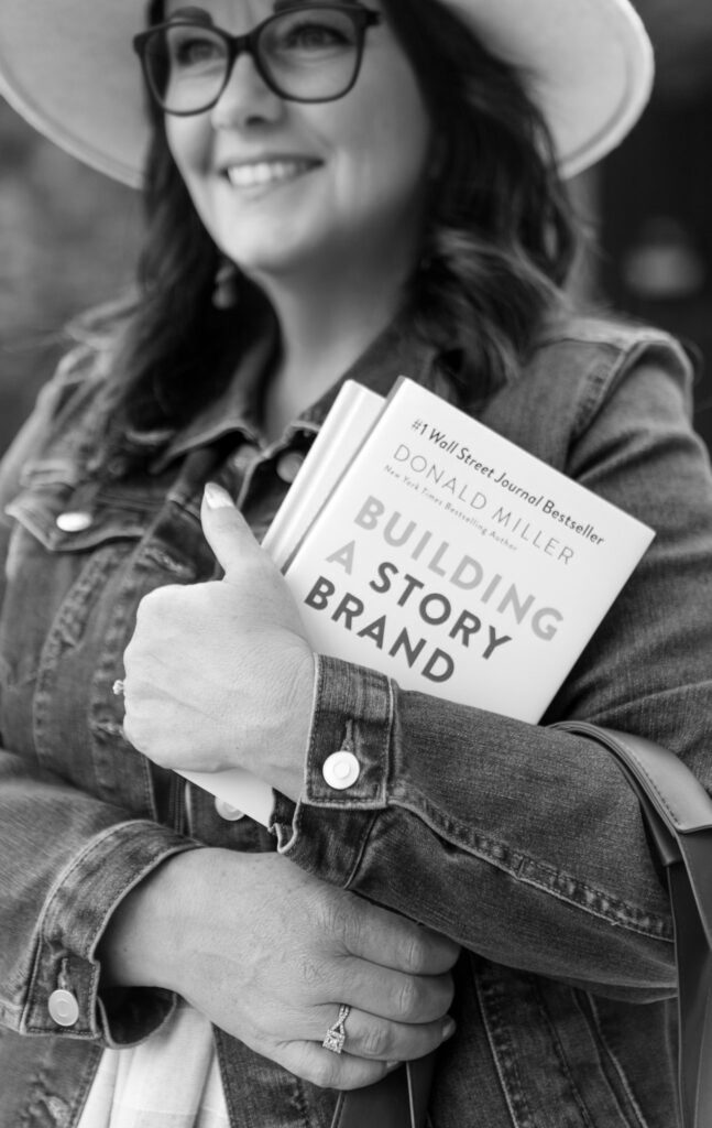
When a new client reaches out with a brand new property and a hand-drawn logo sketch, you know it is going to be a good project. That is exactly how my work with Element 13 Apartments started, and what came out the other side is one of my favorite property branding projects to date.
The Brief: A Name With a Story
A Spokane based Property Management company came to me needing a full brand identity for their newest multifamily development, Element 13 Apartments. The name is not arbitrary. It is a direct nod to the area’s industrial history. Aluminum is element 13 on the periodic table, and the region has deep roots in aluminum production through Kaiser Aluminum.
That kind of built-in story is a property branding designer’s dream. The name already had meaning. My job was to build a visual identity that honored it.
The client came with one early idea: a play on “EL” and “13” as a logomark. They had sketched it out by hand. It was rough, but the concept was smart. The “L” and the “1” share a vertical stroke, four characters that compress the full name into something bold and memorable.
I loved it immediately. We just needed to make it real.
Round One: Elegant and Gold
My first direction leaned into luxury residential. I developed three logo variations using Fashion Regular, a high-contrast display font with tall, elegant proportions, paired with Magallanes for the wordmark. The color palette was warm and refined: a near-black I named Forge, a warm gold accent called Ingot, an off-white called Limestone, and two supporting neutrals.
The logo system had a clear hierarchy. A primary full wordmark with “Element 13” and a gold tile for the “13.” A compact mark (EL13 / APTS in a box) for social, signage, and small applications. And a standalone logomark for watermarks and wayfinding.
The brand pattern drew from aluminum’s molecular bond structure. Circles connected by single bonds in a repeating diagonal lattice. I developed it in three colorways and mocked it up on a lounge wall so the client could see it living in an actual space.
Honestly? I thought it was strong. Clean, sophisticated, market-ready.
Then I got on a call with the client.
The Pivot: Darker, More Masculine, More Industrial
Mayson loved the overall concept. The logo structure, the system, the pattern. But the direction felt too soft for her vision of the property. She wanted something darker. More industrial. More raw.
This is the part of property branding work that separates a good project from a great one. Listening.
I went back to the drawing board on the palette and the typography. Out went Fashion Regular and the gold. In came Industry Bold, a geometric all-caps typeface with custom cutout details that felt like it was built for a factory floor. For the body font I chose FreightText Pro, a slab serif that brought warmth and readability without softening the industrial edge.
The color palette became a completely different story. Five colors, all named for industrial processes and materials:
- Forge: a deep near-black, the primary color
- Oxide: a burnt sienna rust (#9E4626), the accent color
- Smelter: a warm mid-gray for secondary text
- Tarnish: a khaki-toned mid-tone for borders and surfaces
- Alloy: a lighter muddy gray background color
The rust Oxide color became the heart of the new identity. It references iron oxide, the byproduct of weathered metal, and visually it is unlike anything else in the multifamily market right now. Against the deep Forge black, it has real presence.
The brand pattern got updated colorways to match.
The Logo System: Three Marks, One Identity
The final logo system has three distinct marks that function as a family.
The primary mark is the full “ELEMENT 13 / APARTMENTS” lockup with the Oxide tile housing the “13.” It is the hero for the website, leasing materials, and main signage.
The secondary mark is the compact “EL13 / APTS” box. Available in three colorways: Concrete on Forge, Concrete on Oxide, and Forge on Concrete. This is the workhorse for social profiles, door hardware, acrylic wall signs, and key fobs.
The logomark is the standalone dimensional EL13, shown in brushed aluminum in the environmental mockup. This is the physical signage version, the one that gets mounted on a lobby wall or carved into a concrete pillar.
All three share the same geometric letterform DNA. They read as a family instantly.
What I Learned From This Project
A few things worth sharing for anyone considering a property branding project:
The first concept is a starting point, not the finish line. My initial elegant direction was solid work. But it was not right for this client’s vision. The pivot made the final product significantly stronger. Good clients make good designers better.
Color names matter more than you think. Forge, Oxide, Smelter, Tarnish, Alloy. These names do real work in a brand guide. They give vendors, designers, and property managers a shared language. Nobody has to guess which gray is the right gray.
Industrial branding in multifamily is underused. Most apartment brands reach for soft neutrals and script fonts. Element 13 is going to stand out in its market precisely because it does not look like every other property. That is a competitive advantage built directly into the brand.
Ready to Brand Your Property?
If you are a property developer or manager looking for a brand identity that actually means something, one with a story, a system, and staying power, I would love to talk.
At ContentGirly, I work with property owners to build brands that attract the right tenants, impress investors, and look incredible on everything from monument signs to social media.
Get in touch at ContentGirly.com